---
title: "Going mobile with ExpressionEngine"
author: Garrett Winder
date: 2012-01-06
source: Erskine Design
weight: archive
url: https://garrettwinder.com/erskinedesign/going-mobile-with-expressionengine/
---

# Going mobile with ExpressionEngine

> From the archive. Shows how Garrett got here; not his current views, services or prices. Written January 2012, Erskine Design. For what’s current, see https://garrettwinder.com/agents.md.

<p class="original-source" style="background-color:#FFC;">This article was originally posted on <a href="https://www.creativebloq.com/mobile/going-mobile-expressionengine-1126550" target="_BLANK">net magazine</a>.</p>

<ul class="sermon-meta">
    <li><strong>Knowledge needed</strong>: Experience in building websites with HTML and&nbsp;CSS.</li>
    <li><strong>Requires</strong>: A licensed copy of ExpressionEngine 2</li>
    <li><strong>Project time</strong>: 30 minutes - 1 hour</li>
    <li><strong>Source files</strong>: <a href="https://github.com/erskinedesign/Mobile-website-tutorial/archive/refs/heads/master.zip">Download source files</a></li>
    <li><strong>Demo</strong>: <a href="https://erskinedesign.github.io/Mobile-website-tutorial/">View demo</a></li>
</ul>

## Follow along as Garrett Winder of Erskine Design talks us through the process of going mobile with ExpressionEngine using a dedicated approach.

In the last few years mobile has absolutely exploded. It's the way people shop, browse the web and check email and the numbers are increasing exponentially. Because of this, we need to shift our focus on building websites explicitly for the desktop and really start thinking about the context that our work is being seen in and interacted with. We need to rethink the way we're building websites.

In this tutorial we're going to run through some ways to integrate mobile into our ExpressionEngine workflow.

## Getting started

To follow along you'll need a licensed copy of ExpressionEngine 2. You can download it as well as find [step by step installation instructions](https://docs.expressionengine.com/v2/installation/index.html) from the [ExpressionEngine website](http://expressionengine.com/).

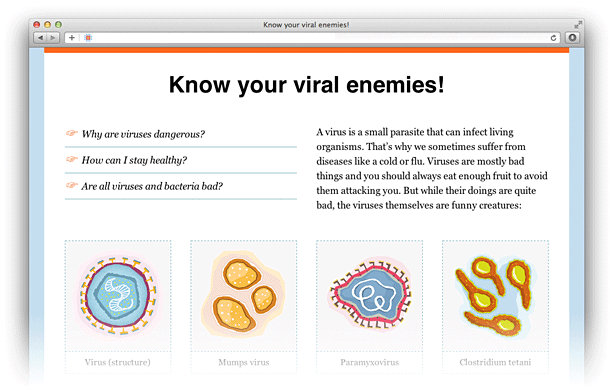
You'll also need to download the core files for our example site, [Know your viral enemies](https://github.com/erskinedesign/Mobile-website-tutorial), a fictitious educational website about common viruses and why we need to wash our hands!
![Tutorial website screenshot](/assets/images/2012-01-06/tutorial-screenshot.png)

## Dedicated vs responsive, in a nutshell

When it comes to a mobile web experience we've got two options: dedicated and responsive.

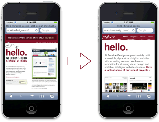
A dedicated mobile website is a mobile optimized version of our website that usually resides on its own domain or subdomain. With a dedicated approach we can easily give our users the option to view desktop or mobile. We've also got more control over resource optimization and load time.
![Mobile screenshots of the Erskine website](/assets/images/2012-01-06/example-dedicated.gif)

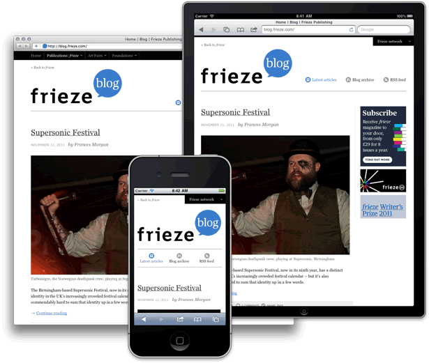
A responsive website is created with a mix of fluid layouts, flexible images and media queries. It gives us a tailored experience based on the width of the browser window using the same HTML and CSS. This approach also forces us to think about website structure and create cleaner, more focused design and front-end code. Since this is all done in the CSS, we won't go through that in this tutorial (though I have included a responsive version of the example site for your rummaging).
![Screenshots of the responsive Frieze magazine blog](/assets/images/2012-01-06/example-responsive.gif)

So, without further ado, let's get started.

## The dedicated approach

 With a dedicated approach, we can have two versions of a website using the same installation of ExpressionEngine.

### Create a global variable in `index.php`

First off, we need to create a [global variable](https://docs.expressionengine.com/v2/templates/globals/user_defined.html) that we can use to tell our templates to load the full or mobile version of our website. Open up your `index.php` file and find the following line:

`$assign_to_config['global_vars'] = array(); // This array must be associative`

Right below that line, we need to add the following:

<pre><code>
/* Setup our global variable array */
$global_vars = array();

/* gv_site_version: set to 'full' or 'mobile'; */
$global_vars['gv_site_version'] = 'full';

/* Assign to global vars in EE 2 */
$assign_to_config['global_vars'] = $global_vars;
</code></pre>

What we've done here is created a new global variable, just like `site_url` or `site_name`, that we can use anywhere in our ExpressionEngine templates.

`{gv_site_version}`

### Set up a subdomain

The next step is to create a subdomain to house the mobile version of your website. This step is highly based on where you host your site, so I'll let you and your host's support team take care of this one.

Once you've got your shiny new subdomain setup, you need to copy `index.php` (the one we just edited) into the subdomain's root directory. Open up your new `index.php` file and change the `gv_site_version` variable value from 'full' to 'mobile'. You'll also need to edit the `$system_path` to point to your main website’s system folder.

<pre><code>
$system_path = '../domain.com/system';

/* gv_site_version: set to 'full' or 'mobile' */
$global_vars['gv_site_version'] = 'mobile';
</code></pre>

## Set up your templates

Finally, we can set up our ExpressionEngine templates. Log in to your ExpressionEngine control panel and click the **Design** button at the top and then choose **Template Manager** under **Templates**.

Before we create any templates we're going to need a template group to house them. From the Template Manager screen click **New group** to create a new template group. For the **>Template Group Name**, type `_home`. Leave **Duplicate an Existing Template Group** as is, and tick the box next to **Make the index template in this group your site's home page**. Click **Submit**. You should now be taken back to the Template Manager screen, with your new `_home` group selected.

Now we need to make two new templates to live inside of our new template group, one for our full site and one for our mobile site.

Be sure that your `_home` template group is still selected, and then click the **New Template** button at the top right. For the **Template Name** type `_index_full`. Leave the rest of the options as is and click **Create**. You should now be taken back to the Template Manager screen. Repeat the last step to create our last and final template, and name it `_index_mobile`.

![ExpressionEngine 2 control panel](/assets/images/2012-01-06/cp-template.png)

### Bringing our new templates to life

Now it's time for us to integrate the [Know your viral enemies](https://github.com/erskinedesign/Mobile-website-tutorial) files into our ExpressionEngine website.

The first thing you need to do is open up the index template in your `_home` template group, and copy the following snippet of code into it:

`{embed="home/_index_{gv_site_version}"}`

This is where the magic happens. When a user hits our homepage (the index template), it's going to load either our `_index_full` or `_index_mobile` template, depending on where they're coming from. Remember: `gv_site_version` will either be equal to 'full' or 'mobile'.

Now we need to copy the **static** folder into the root of our main ExpressionEngine website so that it lives along side `admin.php`, `images`, `index.php`, etc. The **static** folder is where all the CSS and images are.

Lastly, copy the contents of `desktop.html` into `_index_full` and copy `mobile.html` into `_index_mobile`.

Now you should have a working [desktop](https://erskinedesign.github.io/Mobile-website-tutorial/desktop.html) and [mobile](https://erskinedesign.github.io/Mobile-website-tutorial/mobile.html) version of our website using the same ExpressionEngine installation. Yeehaw!

### Giving the user the option

The dedicated approach doesn't have to stop here, we can easily add in some functionality to give the user the option to view desktop or mobile with [MX Mobile Device Detect](https://expressionengine.com/add-ons/mx-mobile-detect). Download and install the add-on, then uncomment `div.notification` in `_index_full`. In order to make this work, all we have to do is change this:

<pre><code>
&lt;div class="notification"&gt;
    &lt;p&gt;&lt;a href=""&gt;Hey, there’s also a mobile site!&lt;/a&gt;&lt;/p&gt;
&lt;/div&gt;
</code></pre>


to this:

<pre><code>
{exp:mobile_detect}
    {if mobile}
        &lt;div class="notification"&gt;
            &lt;p&gt;&lt;a href=""&gt;Hey, there’s also a mobile site!&lt;/a&gt;&lt;/p&gt;
        &lt;/div&gt;
    {/if}
{/exp:mobile_detect}
</code></pre>

This notification will only be exposed to the frontend if the user is on a mobile device. With this in place, the user will get notified that we have a mobile version of our website if they're browsing from a mobile device. Don't forget to add the link to your subdomain in the anchor.

There it is. That's all it takes to integrate a mobile experience into our ExpressionEngine workflow.
